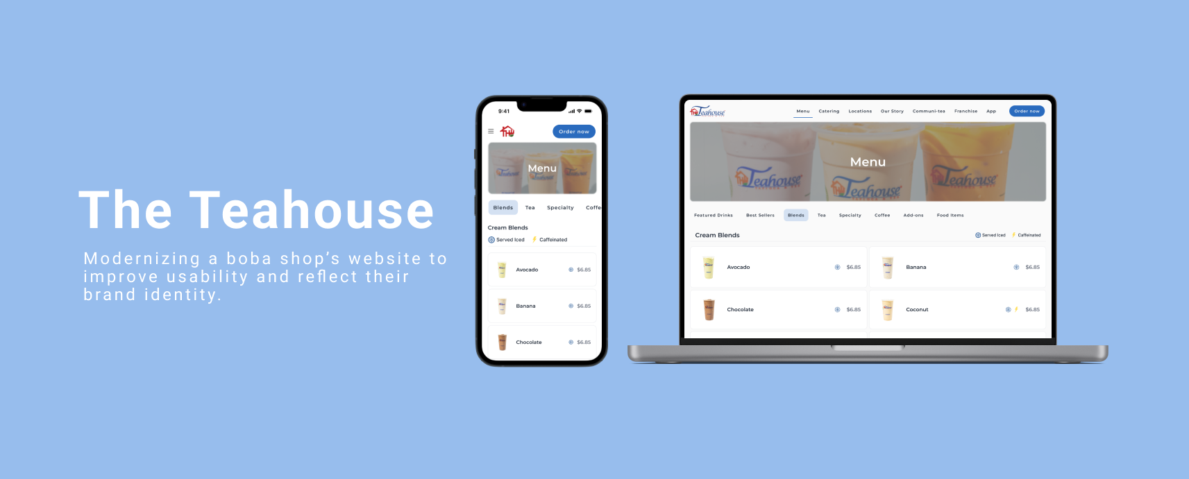
ROLE Freelance UX/UI Designer (via Midnite Agency)
DURATION 8 weeks
SCOPE UX Audit | Wireframes | Visual Redesign
The Problem
Outdated visual design that didn’t reflect in-store experience
Poor hierarchy and readability
Weak calls-to-action (location, hours, menu visibility)
Brand lacked cohesion
My Role
Conducted heuristic evaluation of existing site
Identified navigation and hierarchy issues
Redesigned information architecture
Created responsive wireframes and final UI in Figma
Collaborated with marketing agency on brand alignment
Competitive Analysis

Competitor
Kung Fu Tea
R&B Tea
Insights for Design
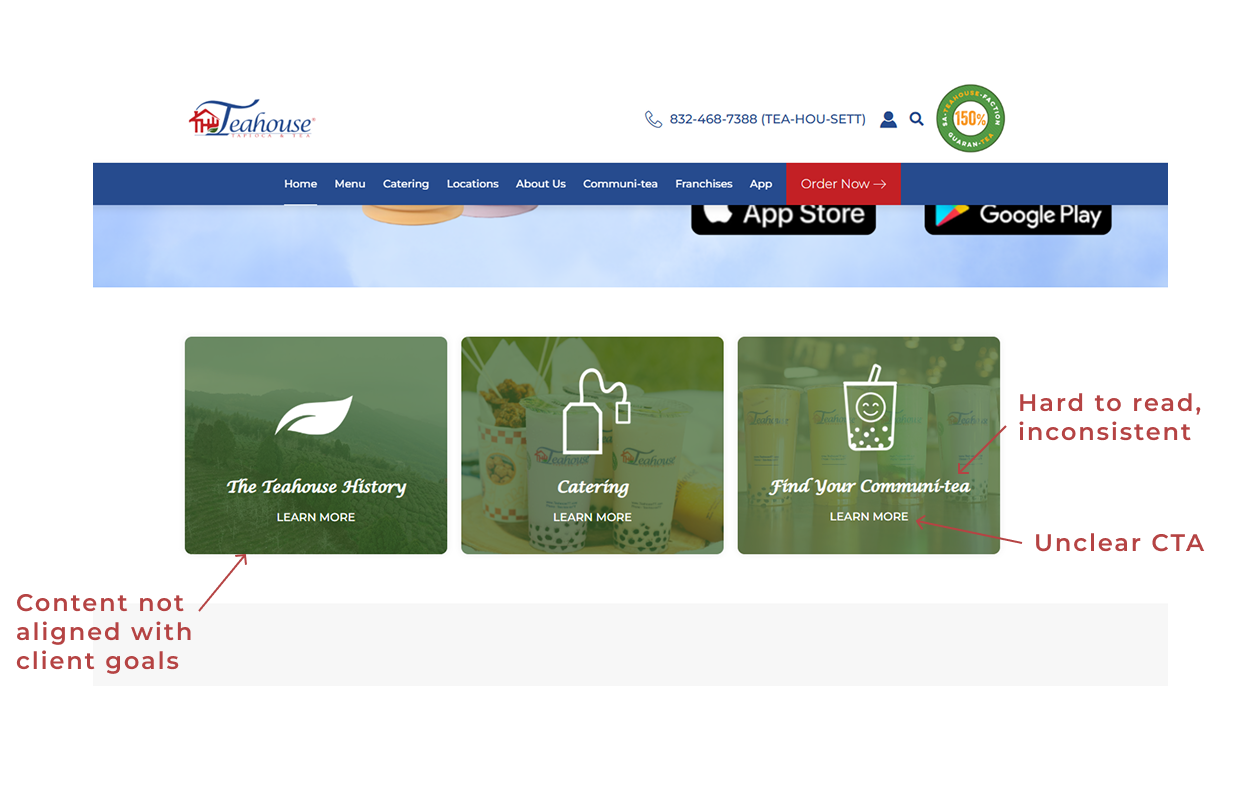
Text hard to read, users may overlook important information.
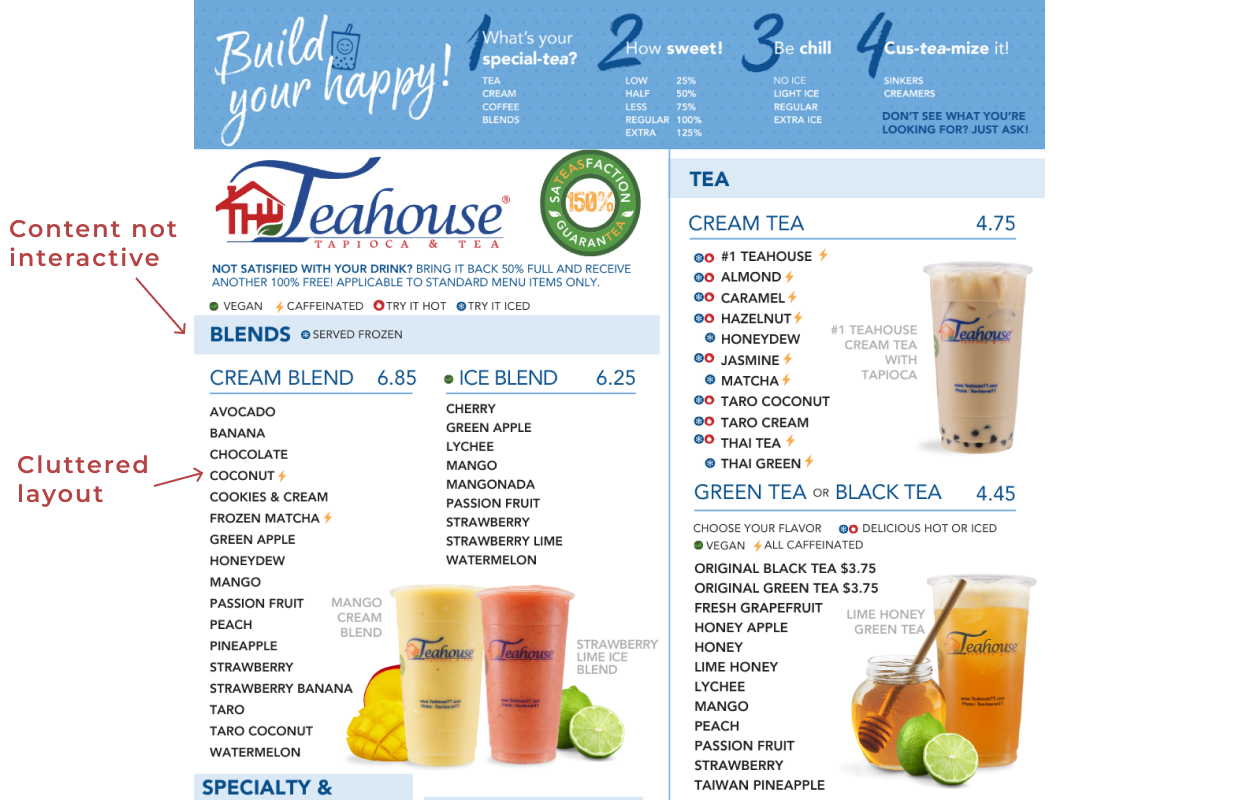
Menu images failed to load, making it hard for users to identify items.
Solution
Establish clear hierarchy, spacing, and contrast.
Improve product visibility in our design.
Low-Fidelity Wireframes
I created low-fidelity wireframes to define content structure, hierarchy, and user flow before moving into visual design. These were the few of the screens that was presented to stakeholders for early alignment and feedback.
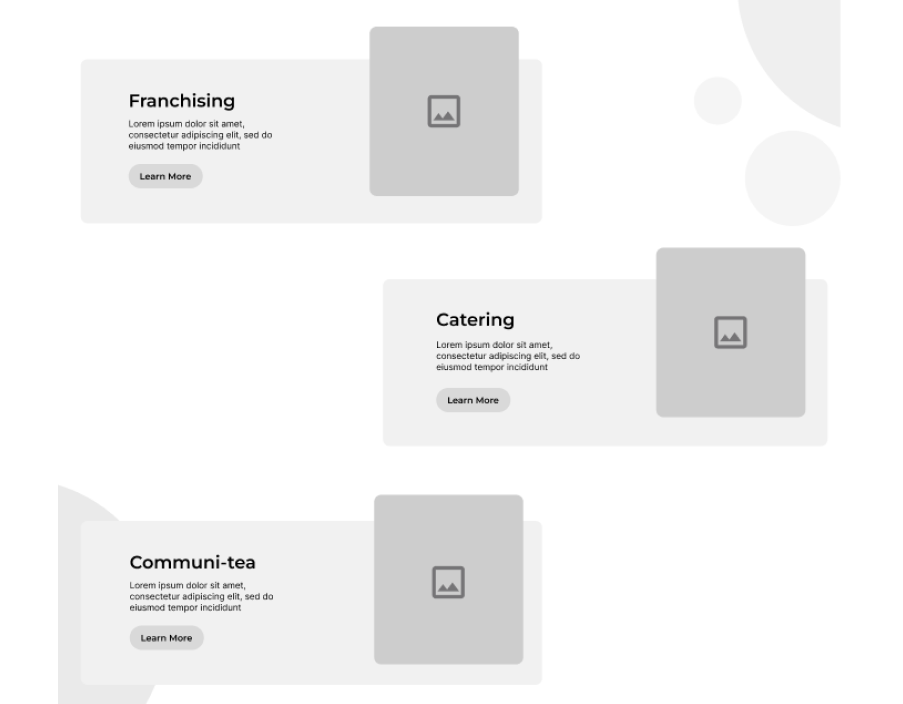
Replaced content to align with business goals. Short descriptions added for clarity.
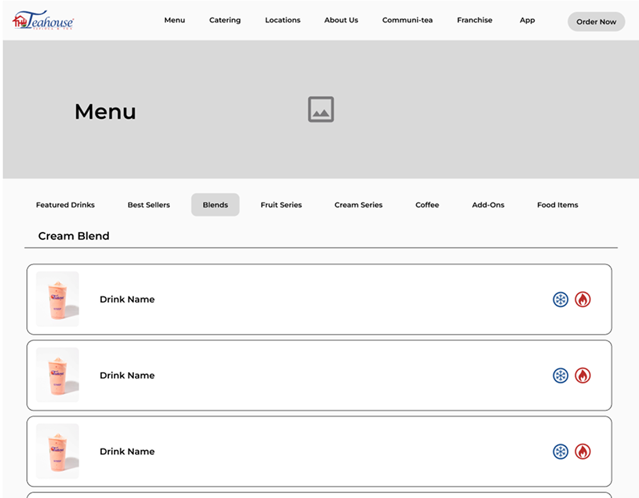
Interactive menu tabs defined early.
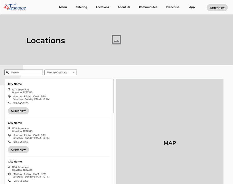
Location info structured for quick reference.
Stakeholder Feedback
The low-fidelity wireframes were presented to the client and received positive feedback. The stakeholders appreciated the improved hierarchy, clear CTA placement, and the prioritization of Franchising in line with business goals. The interactive menu structure and logical grouping of content were particularly well-received. This early validation helped guide the visual design and ensured alignment with both user needs and business objectives before moving to high-fidelity designs.
Design Execution
Franchising, Catering + Community Section
Before
After
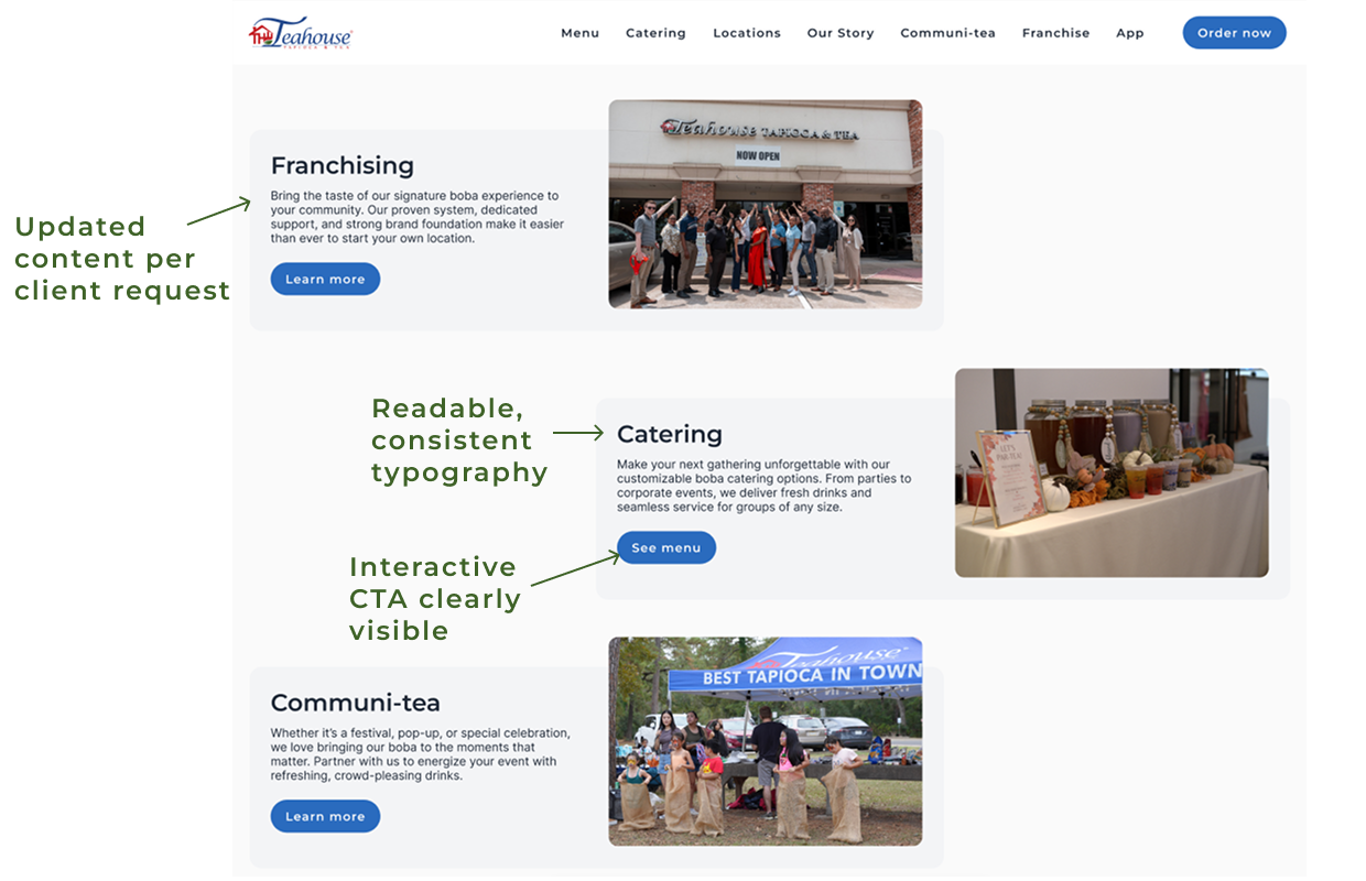
I redesigned this section to clearly highlight Franchising, Catering, and Community offerings. Updated typography for readability, added concise descriptions, and converted ‘Learn More’ links into interactive buttons to improve scanability and guide users through the content.
Menu
Before
After
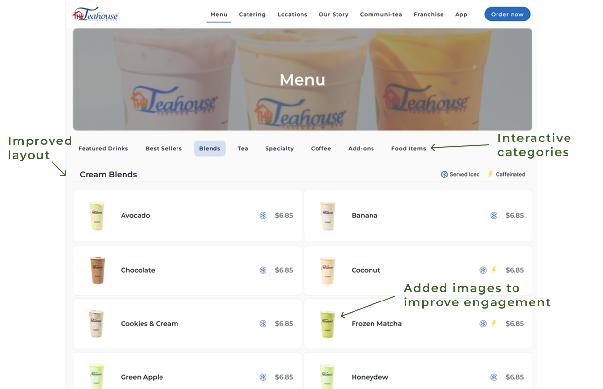
I enhanced the menu by adding images for each drink, reorganizing categories with interactive click-through navigation, and improving spacing and typography to create a more engaging experience.
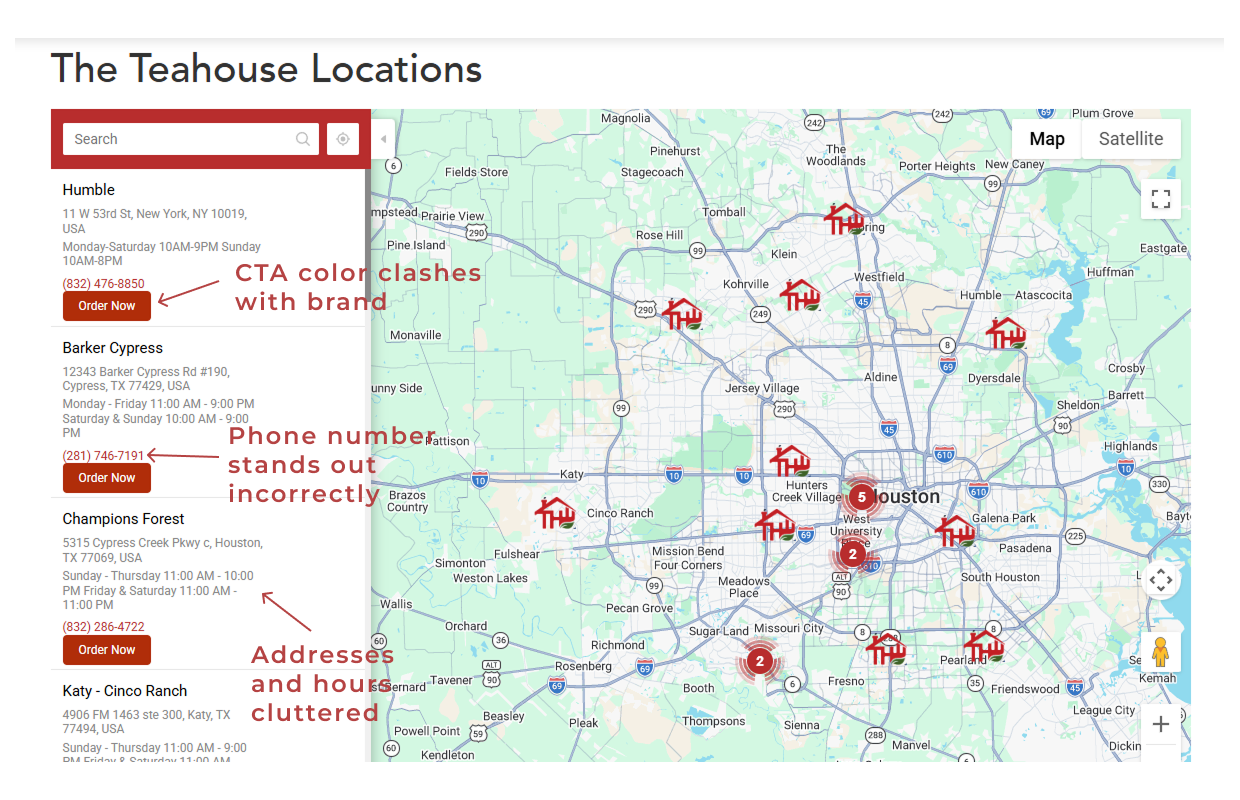
Locations
Before
After
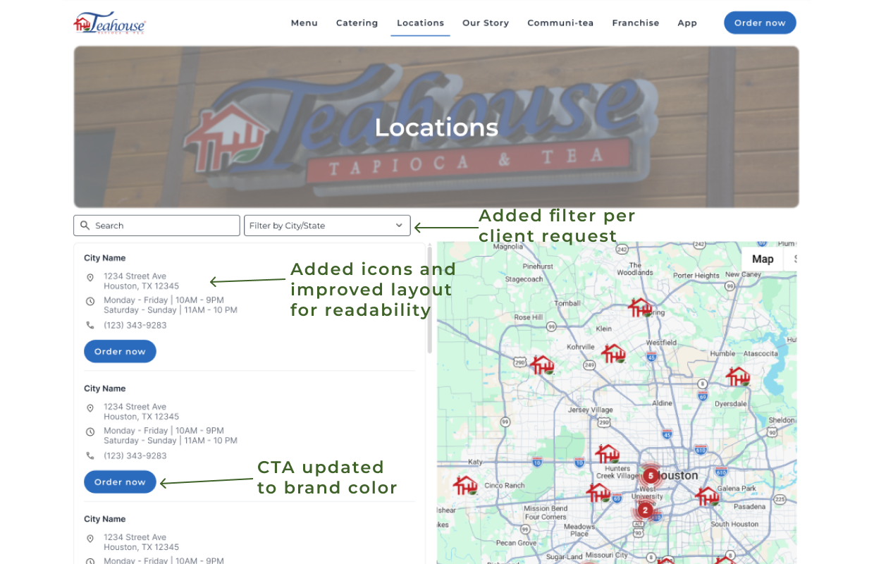
I redesigned the Locations page to improve scanability and hierarchy. Updated the CTA button to the brand’s primary color, aligned phone numbers with the text hierarchy, and decluttered addresses and hours for easier readability.
Impact
The redesign improved usability, hierarchy, and brand consistency across key pages. A high-fidelity Figma prototype demonstrated interactive flows such as the click-through menu and navigable sections which allowed the stakeholders to experience the intended user journey. These updates made content more scannable, CTAs clearer, and the overall experience more engaging.
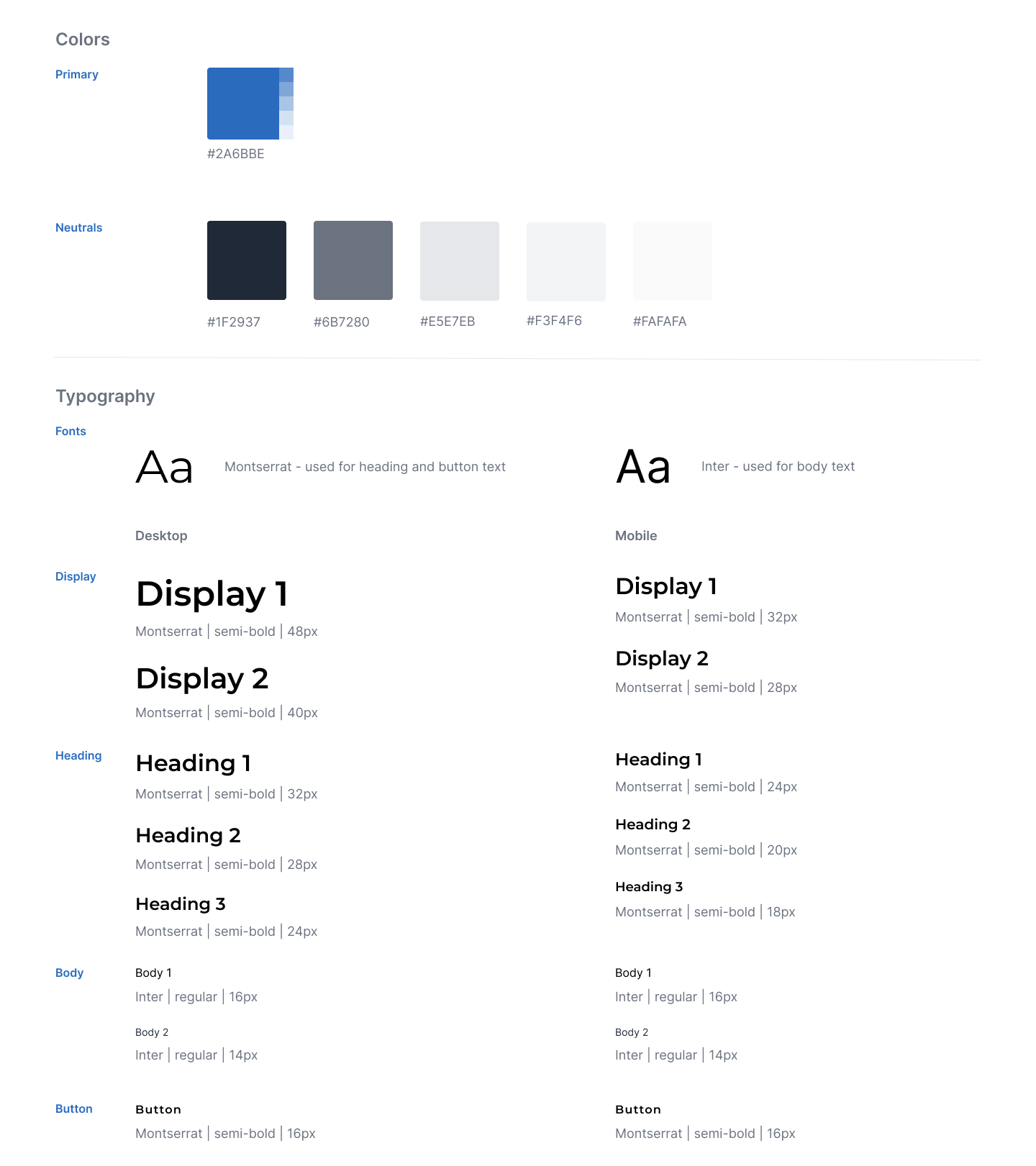
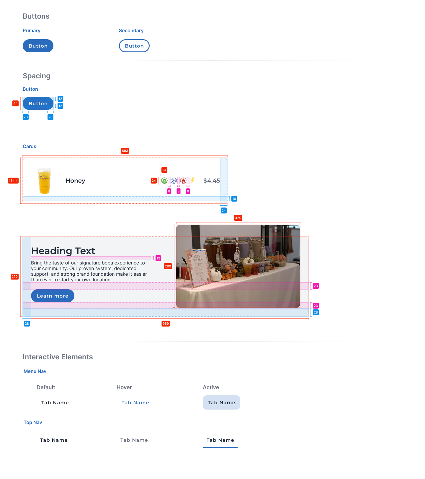
Design System
To ensure a cohesive user experience across all pages, a consistent design system was applied, including typography, color usage, spacing, and interactive elements aligned with the brand identity.
Conclusion
reflection
What I learned from this project was the importance of hierarchy and consistency in creating an intuitive experience. Even small adjustments like decluttering information and standardizing CTAs had a noticeable impact. Stakeholders were pleased with the final designs, confirming that the updates met both user needs and business goals. Moving forward, I would explore usability testing and mobile-specific interactions to further optimize engagement.