ROLE UX/UI Design | Product Design
DURATION 2+ Years
PRODUCT DESIGN TEAM 2 Designers | Product Manager | Developers
TOOLS Figma | FigJam | Jira | UXtweak (usability testing)
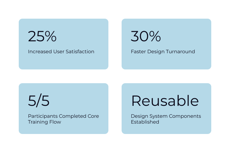
IMPACT Increased user satisfaction by 25% and established a created reusable design system componenets
Overview
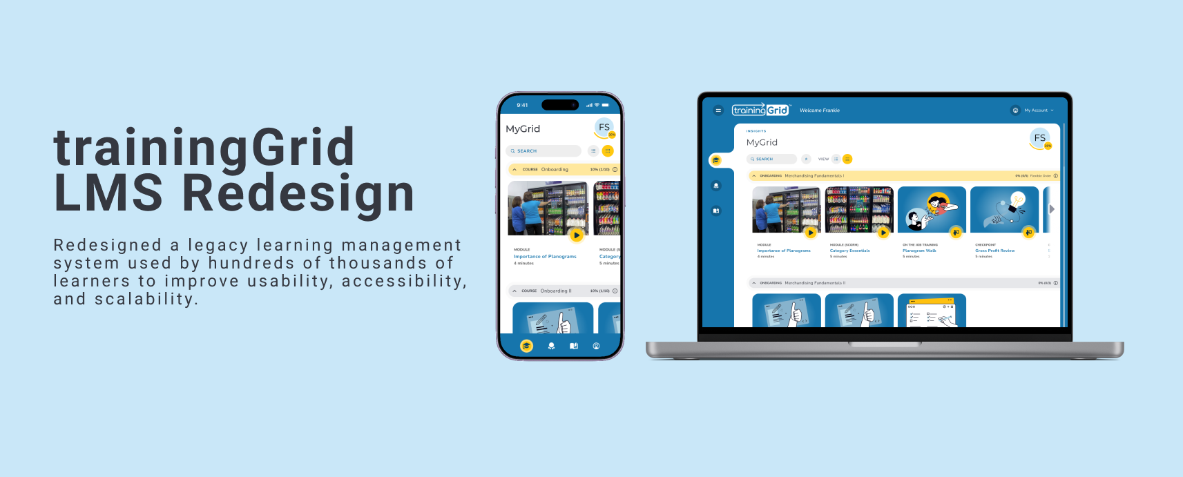
Ready Training Online’s trainingGrid is a B2B SaaS learning management system that helps organizations assign, track, and report on employee training. The platform served learners, managers, and administrators, but the interface had become outdated and difficult to navigate. Our goal was to improve usability and modernize the experience for its ~800,000 users (about 80% of the user base), while streamlining workflows and better engaging a primarily newer generation audience in ongoing learning.
The Problem
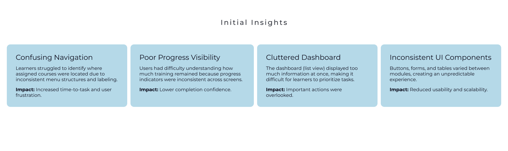
Users struggled with inconsistent navigation, cluttered screens, and poor information hierarchy. The LMS had an outdated user experience, was built on legacy technology, and lacked a mature UX program. This negatively impacted sales, making a comprehensive redesign imperative.
Goals
Simplify navigation
Improve accessibility (WCAG 2.2 AA)
Modernize the visual design
Reduce design inconsistencies
Increase user satisfaction
My Role
As one of two UX/UI Designers, I led the redesign of learner and administrative workflows, built reusable design system components, conducted usability testing, and partnered with product and engineering to deliver production-ready designs.
Research + Discovery
I analyzed support feedback, reviewed competitor products, and conducted usability testing to identify the most confusing workflows and prioritize improvements.
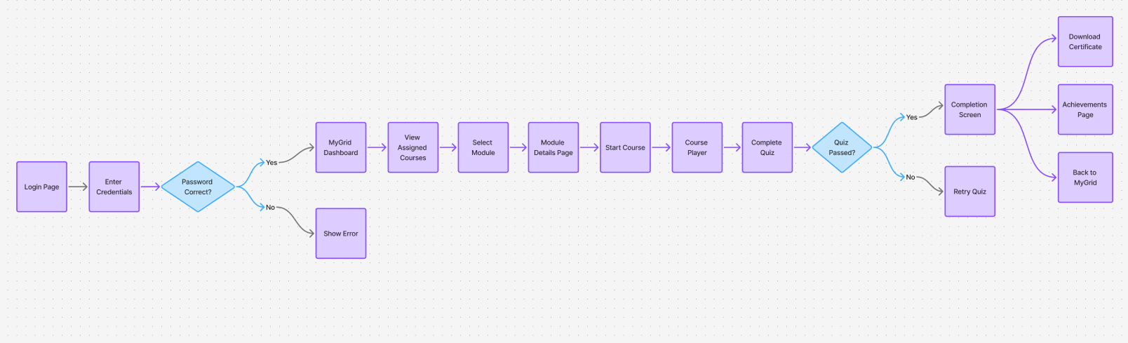
User Flow
I mapped the learner journey from login to course completion to uncover opportunities to reduce clicks and clarify navigation.
Prototype
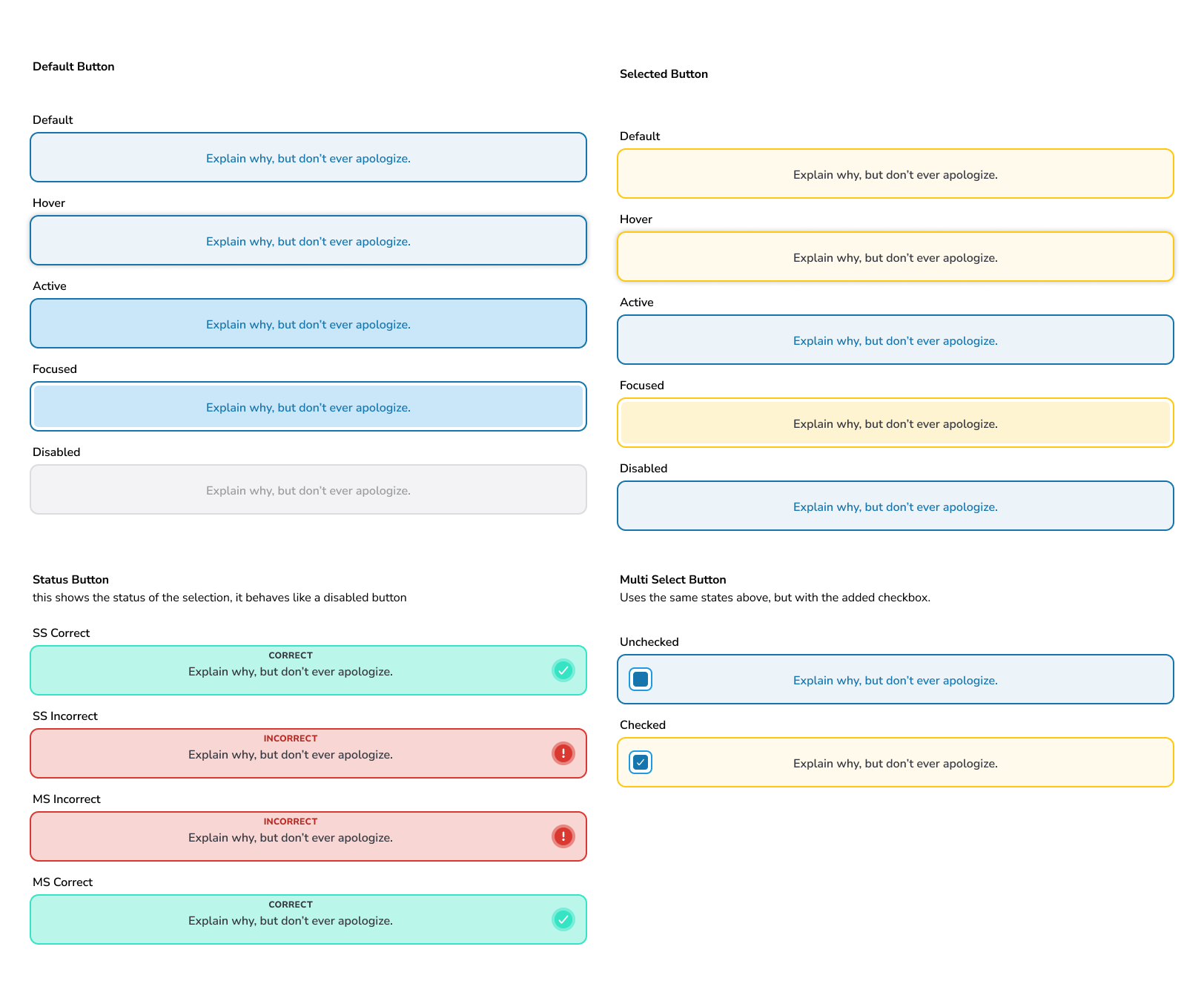
Design System
Designed several custom Figma components for our design system, ensuring consistent, accessible, and user-friendly interface across the application.
Key components included the application header, left navigation, card components, and buttons.
Figma library streamlined design process, enabling our team to build screens more efficiently and maintain a unified visual language.
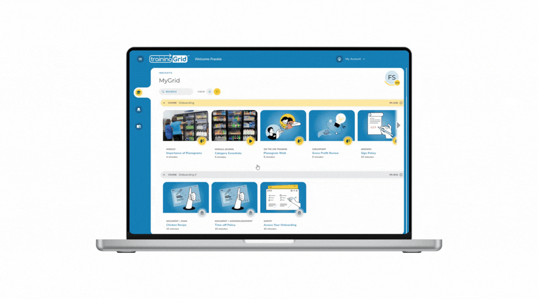
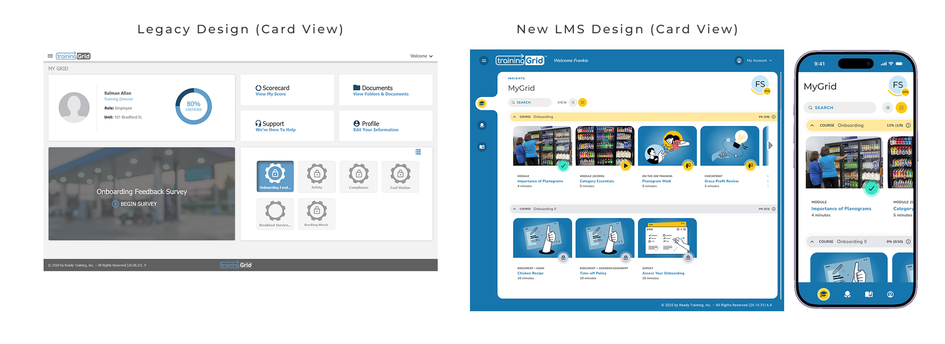
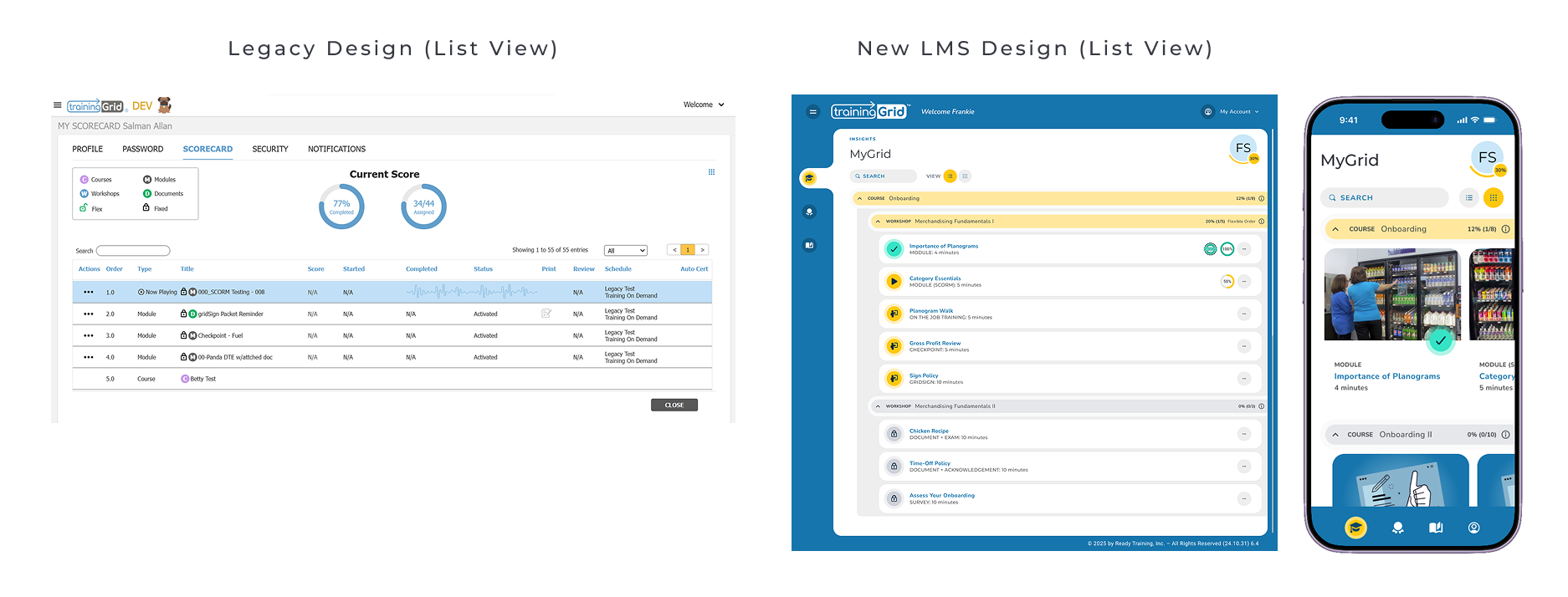
Final Designs
The final redesign introduced a modern interface, improved hierarchy, and more intuitive workflows for learners and administrators.
Usability Testing
To validate the redesigned learning experience, I conducted moderated usability testing with 5 participants using UXtweak. The primary task focused on the end-to-end learner workflow of locating and completing a required training module.
Participants were asked to:
Locate assigned training
Launch a module
Complete the module workflow
Testing showed that users completed tasks faster and found the updated navigation easier to understand, especially when locating courses and tracking progress.
Results + Impact
The redesign improved workflow efficiency, simplified navigation, and established a scalable foundation for future product enhancements.
Key Takeaways
This project helped me grow as a product designer by working on a complex SaaS workflow with multiple user roles and constraints. I learned how to simplify navigation in a way that improves usability without sacrificing functionality.
It also strengthened my collaboration with product and engineering, and gave me a deeper understanding of how design systems support scalability and consistency across large products.
Usability testing reinforced the importance of validating designs early, as even small changes in structure significantly improved task completion and user confidence.
Overall, I shifted from focusing mainly on UI design to thinking more strategically about end-to-end product experiences and system-level design decisions.